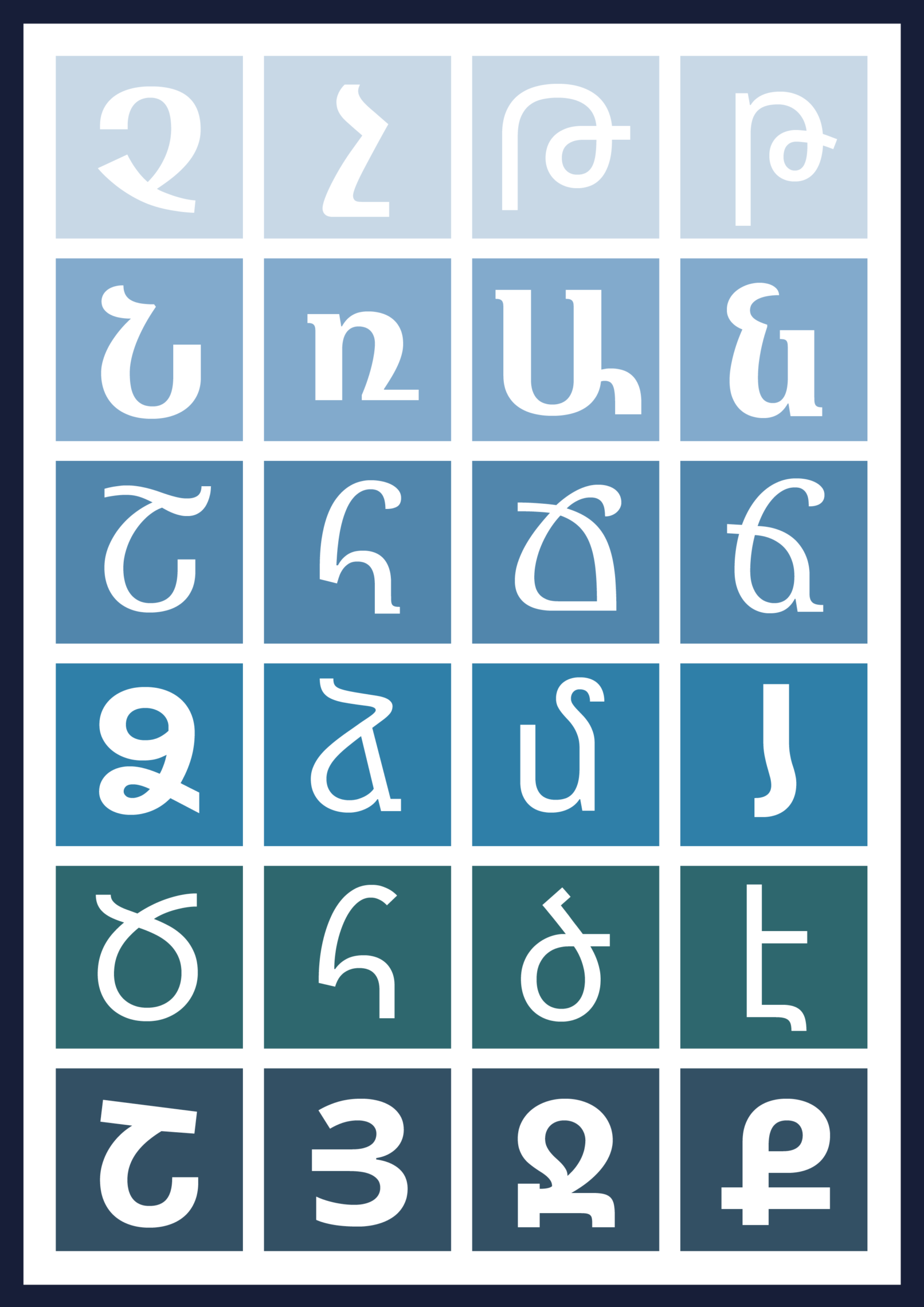
Noto Armenian
Design of the Noto Armenian for the Google Noto font family
In 2014 Monotype US commissioned me to review and redesign the Noto Sans & Serif Armenian Regular and Bold .
Noto supports 800 languages and 100 scripts in up to eight different weights. The aim of the project was to create a unified visual system.
Before I could get into design I had to review the existing version, analyse and evaluate its design, and consider previous critical remarks and comments.
I felt that the Noto Armenian font should be in between tradition and modernity, while being authentic, natural looking, but also a contemporary typeface.
Noto Armenian is a typeface that stands on its own design merit and gives to readers a contemporary, but authentic texture in which they can recognise their own identity. A typeface that can be used proudly, because it is not a reminiscence of an adaptation of any existing Latin typeface, but an independent font that works well alongside Latin.
Noto Sans Armenian Regular and Bold (v.2.x)
Noto Serif Armenian Regular and Bold (v.2.x) are released by Google.
