Hagelslag
A Sans Serif typeface for art publications
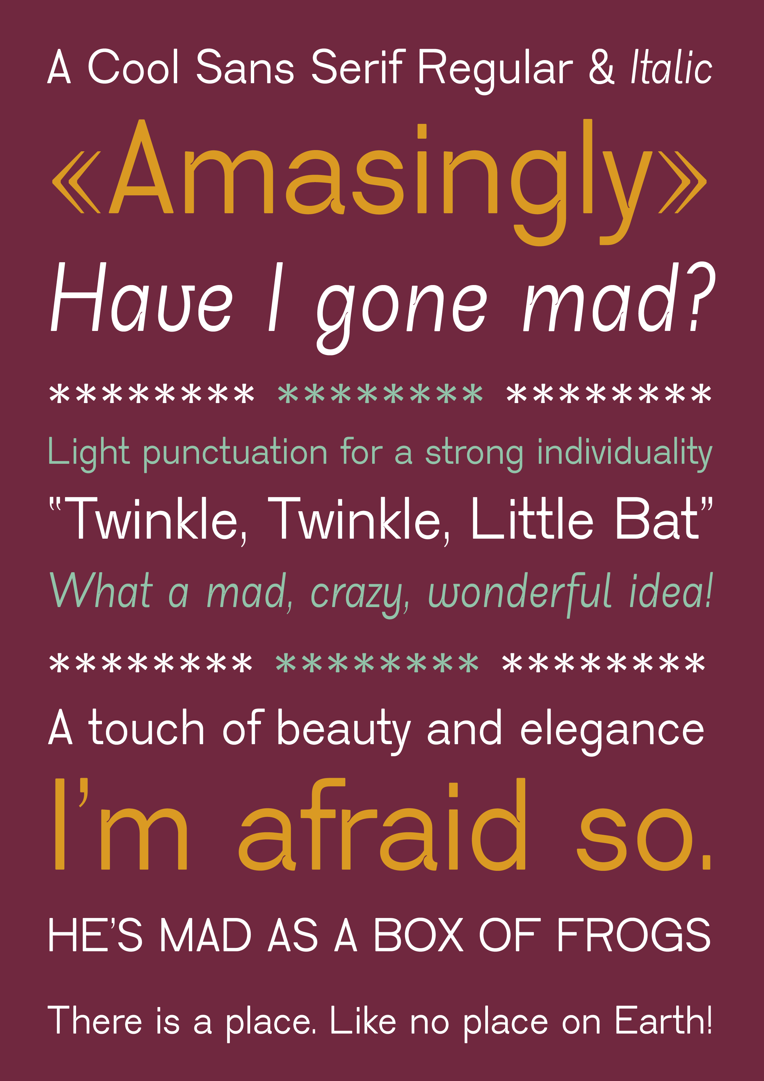
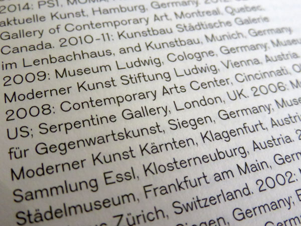
Hagelslag is a Sans Serif text and display typeface family in Regular, Italic and Bold weights designed to work in books.
The font was commissioned by the graphic design studio Fraser Muggeridge in 2014 and it has been used for some of their editorial projects.
Hagelslag is inspired by the elegant Sans Serif typeface Breede Schreeflooze, shown in the 1932 type specimen published by Enschedé Typefoundry.
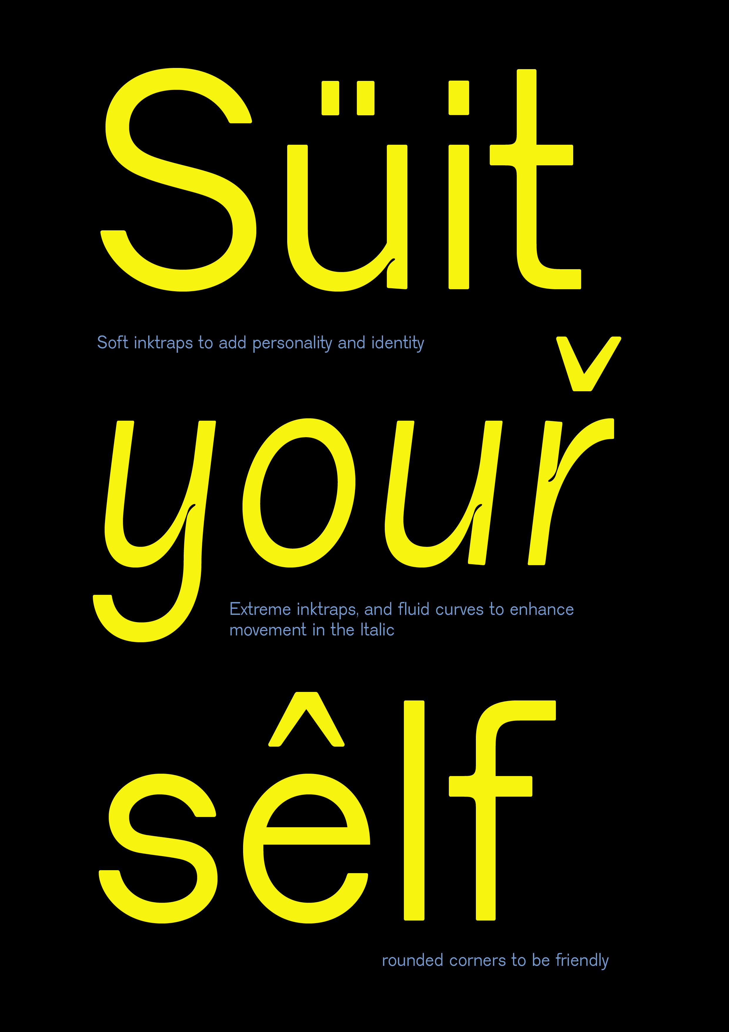
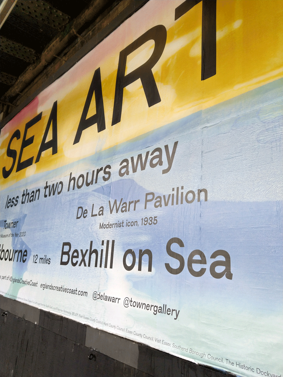
Hagelslag has soft ink traps to add personality and identity, rounded counter to be friendly. Detailed design features such as the flat and long hook of the lowercase letter ‘f’ and terminal of ‘t’ that gives the typeface a touch of beauty and elegance, were features kept from the original design. Hagelslag has light punctuation for a unique and blowing personality.
Instead of providing lining or non-lining figures, Hagelslag presents a different stylistic set for numbers: funky figures versus classic numbers.
In 2016 a customised version of Hagelslag Regular and Bold was designed for Fraser Muggeridge studio to be used in the exhibition: ‘Values of Design’ at the V&A, Design Society in Shekou, Shenzhen, China (2 December 2017-4 August 2019).
Hagelslag has been used in the editorial projects:
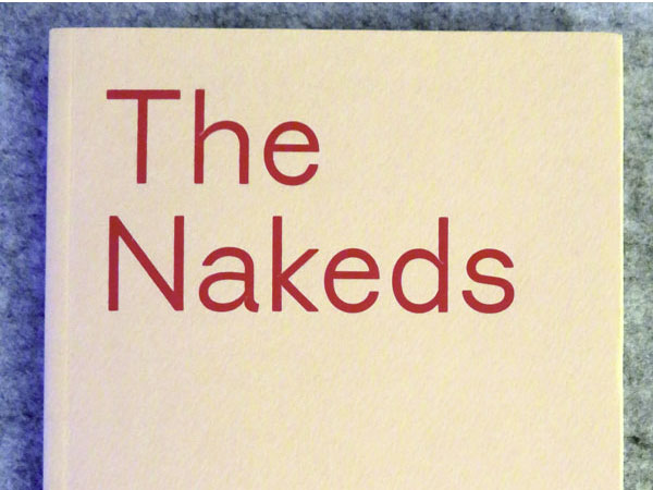
- ‘The Nakeds’. London: Drawing Room, 2014.
- Chris Marker, ‘A Grin Without a Cat’. London: Whitechapel Gallery, 2014.
- Mila Calix, ‘Inside there falls’. London: Mute Song, 2014.
- ‘The Case for a Cultural Boycott of Israel’. UK: Artist for Palestine, 2015.
Hagelslag has been used in the exhibition:
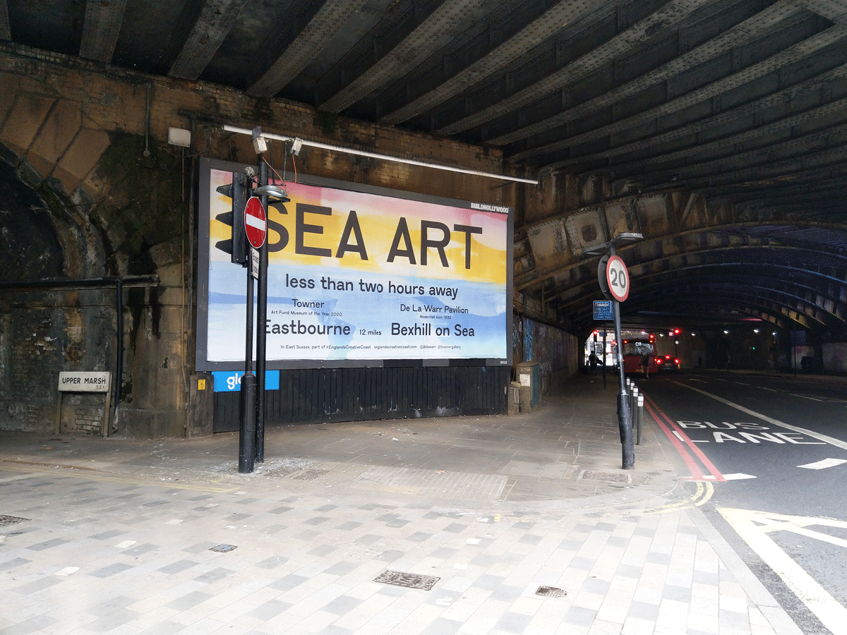
- The Nakeds at the De La Warr Pavilion, Bexhill on the Sea, East Sussex (25th September to 29 November 2014).